


The painting medium of watercolour has been particularly associated with England for several decades. However, its origins lie inside the history of European painting. Pigments, which include earthy materials or vegetable fibres were grounded to powder and gum or egg was added as a binder, in the Medieval era. They were applied to vellum to beautify manuscripts, to depict non-secular and secular scenes - as well as to enhance capital letters and decorate the borders.
The usual practice was that shade would be blended with a dark pigment along with lead white, which gave it body and high-quality chromatic intensity. This made it perfect for ornamental work, and as time passed by, it was used less for devotional purposes and more for decorative purposes. By the 17th century, although religious miniatures were painted by watercolour or the ‘body’ colour, the medium changed into becoming more related to secular topics which include landscape, or the decoration of different things. ‘Body colour’ turned into being recognized via a French term called ‘gouache.' During this era, some artists began to use watercolour effectively, that is, pigments floated in the transparent medium of water which allowed it to shine through the washes of hues.
Paper production became more modern by removal of incidental impurities and discolourations; thus, the luminosity was achievable with watercolours in a ‘tinted’ drawing. This medium was primarily used for landscape drawing when the brightness of the sky needed more emphasis. Thus, the onset of the watercolour medium was revolutionary for many artists in the world.
It is challenging to work with watercolours due to the fluidity of paints, but that is also the fun part of this medium. Let's check out the incredible characteristics of watercolours to understand the behaviour of this medium to create interesting effects.
Opaque & Transparency:
Watercolour paint is admired for its transparency which represents the ability of light to pass through the paint and reflect the back of the white surface of the paper to create a glorious luminescent effect.
Transparency plays an important role when it comes to layering; it becomes essential to plan and layer the transparent colours to go above opaque colours, as they might not show up the other way around. You could make opaque colours more obvious by thinning them with water, but this will diminish their intensity.
So how to test which is transparent and which is opaque? Professional Artists quality brand names commonly let you know on the tube or pan if the shade is transparent, semi transparent or opaque, each brand differs. Winsor & Newton brand, you can find a white rectangle for transparent paints, a black/white triangle for semi-opaque and black rectangle for opaque colours. If transparency is not indicated, search for the producer's guide in which they explain the traits in their paints.
Subsequently, many skilled artists like to test new paints before they get a chance to use them on an art piece. It is effortless to check the transparency: Draw a bold black line with a waterproof marker on a bit of paper. Paint each colour over a segment of the line and let it dry. The colours that tend to disappear over the line are the transparent colours, and the clearly visible colours are the opaque watercolours. You will also see some colours to be semi-transparent or semi-opaque.
Permanence:
Permanence refers to the capability of the paint to resist exposure to light and humidity without fading, darkening or colour shift. Also referred to as lightfastness, is an essential factor because who knows how future generations may evaluate your artwork, so why not give it a good lifespan? In short, the longevity of your Artwork depends on this factor. Watercolour with an excellent lightfastness is also known as non—fugitive watercolour paint, and the colours that fades quickly with time is known as a fugitive watercolour paint.
A quick tip: When buying watercolours, check ASTM rating on the packaging which would usually be " Excellent" or "Very Good " lightfastness. Products without the ASTM stamp is problematic, who know what chemical is in the paint.
Stain & Non-stain:
Some watercolour paints creep into the fibers of the substrate and "stains" it, whereas some watercolours dry out and are easy to lift off or rub with a scrub brush, it is ok to scrape off speckled highlights with a Light Duty Knife, but it does damage the paper and should only be used at the end of your painting. King’s Framing & Art Gallery carries Mono Sand Eraser, Pencil Eraser Perfection 7058B or Staedtler Battery Operated Eraser to give smoother highlights or lift paint colours. You also can use a lifting agent, like Winsor & Newton Lifting Preparation aiding the lightening or lift colour, even staining colours from your paper.
If you're buying paints for the first time, don't worry about this, just have fun playing with your new paints, but if you realize you will be using it for layering or lift-off techniques you may need to make sure you have an excellent mix of staining and non-staining watercolour paints. Lay your non staining colours first and then add your staining colours on top, creating interesting layered effects.
Staining is an important factor to consider when you are planning to do layers. A few non-staining pigments, like cobalt blue, are great for shadows under a wash if you need to lift a colour. They may elevate and blend with the layers on the surface, making them look thick, obscure and blocking luminosity, but used wisely they come in handy, like in shadows when light needs to be obscured.
Unfortunately, it's no longer easy to understand which might be a staining colour and which aren't because each brand has its pigment formulation process. It is good to check colours beforehand on a separate piece of paper. Permit the colour to settle down and dry, notice how the pigments stay when you rub it off with a Silver Scrubber Brush or use absorbent paper towel or Kleenex. The amount of colour left will enlighten you about it’s staining intensity.
Granulation:
The pigment particles inside the paint can be heavy or light. Watercolour paints with heavier particles tend to isolate itself from water and accumulate within the paper surface hollows. Granulation is related to the appearance of the texture. Distinct sized particles may have slightly different representations of colour - typically the finer the particle, the lighter the version of the colouration.
What’s nice when mixing a transparent colour with a granulated could you have some beautiful effect for the granulation will sit at the bottom while the transparent colour float to the top of the heavy pigments, thus will lay on top of the paper convex giving interesting effects, an optical illusion.
Elements of sediment colours comes from rocks and has the heaviest granular particles. Even though there are sixty variety of greyish sediment colours in particular, only four selected greyish category colours allotted; grayed-green, grayed-brown and grayed-red, with the addition of black or gray, which are the result of decayed organic matter, most rock sediment characteristics stem from iron stains that produce “Ferric iron (Fe+3) produces red, purple, and yellow colours (from minerals like hematite and limonite). Ferrous iron (Fe+2) produces greenish colours.
Quality:
When shopping for watercolour paints, you’ll notice that there are two kinds available – Artist’s quality and student’s quality. Artists' watercolours have a higher concentration of finely ground quality pigments with excellent permanence scores, while the student’s quality additionally may contain less expensive pigments and greater amount of low-grade fillers and extenders.
Your choice depends on your budget and your artistry goals. As compared to student’s quality, the Artist’s quality watercolours are a bit expensive, but worth the cash because of its high permanence, superior transparency, and intensity.
A great option I would recommend is that you purchase 3 to 6 quality colours and learn to mix. Sometimes buying sets helps for they combine colours that will work well together Plus a quality, mix blend, pointed round brush, that can create broad strokes to fine detail lines. The proper tools will go a long way for you to enjoy your learning process.
I love this quote from Virgil Thomson, 1896-1989, an American composer and critic, instrumental in the development of the "American Sound" in classical music.
"Try a thing you haven't done three times.
Once, to get over the fear of doing it.
Twice, to learn how to do it.
And a third time to figure out whether you like it or not. "
With watercolours you can paint in any style, from loose to photorealist landscapes, cityscapes or still life or colourful abstracts.
It's time to make friends with watercolours since you've now learned the language between a watercolourist and the paint box. These characteristics will help you in knowing your watercolours and getting to know the methods through which it is capable of expressing itself. As you acquaint yourself with these watercolour characteristics, the more effective your painting will become.
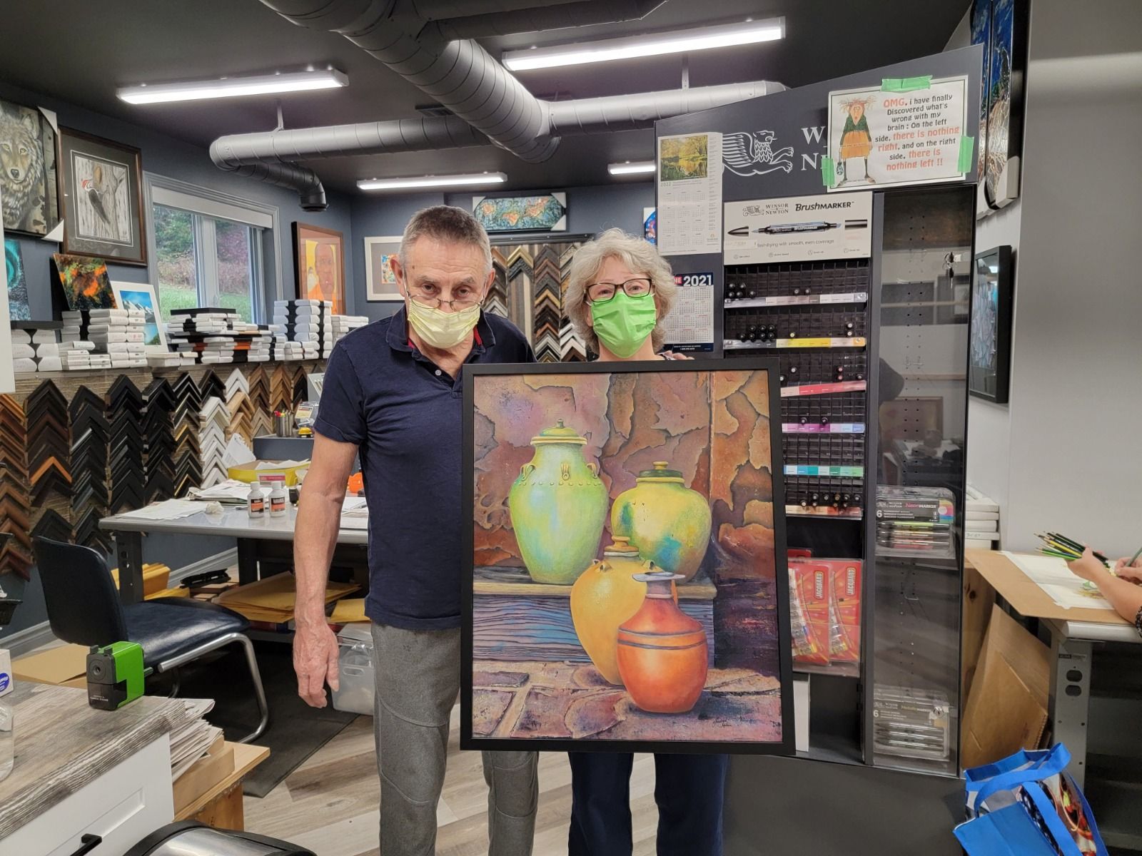
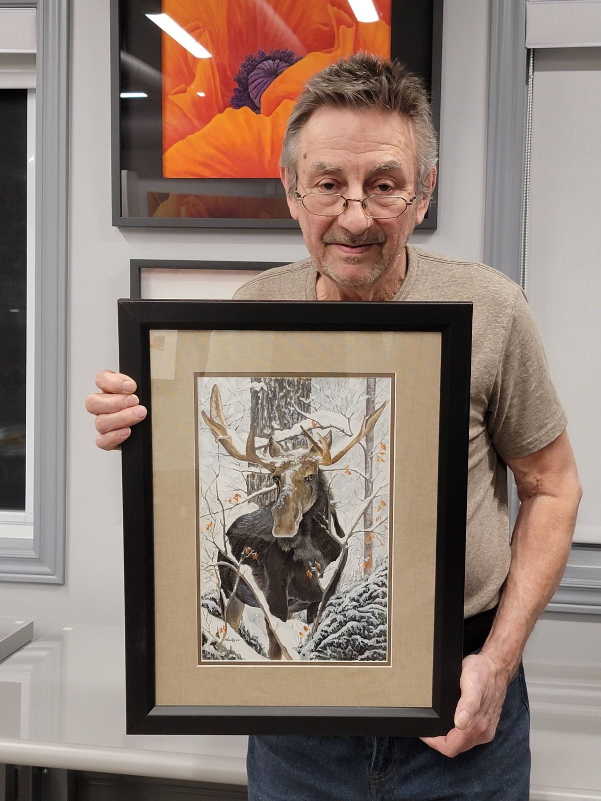
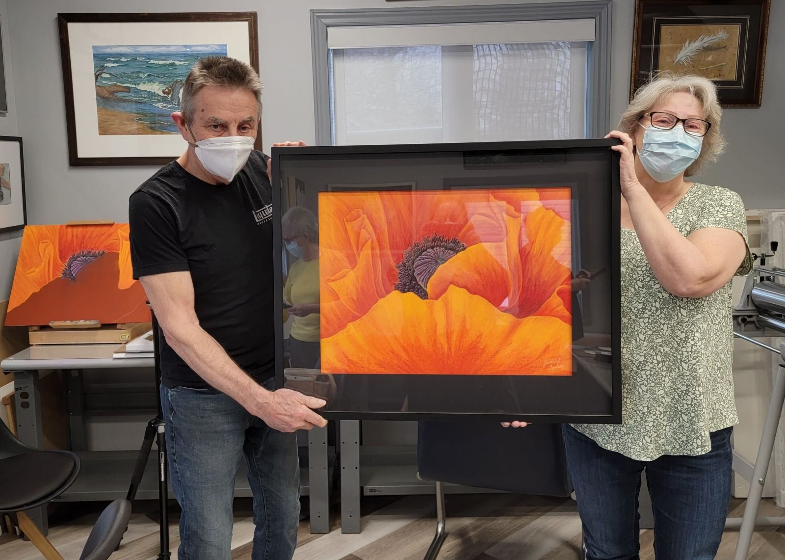
At King’s Framing & Art Gallery, we are your gateway to the watercolour world! We have some amazing watercolour brands like Winsor & Newton, Sennelier, Daniel Smith, M Graham, Holbein, Mission Gold, Lukas and Finetec to name a few.
Also, if you are a watercolour artist and have created something amazing & inspiring, take part in the watercolour contest 2019 and stand a chance to WIN a new Winsor & Newton watercolour gift set and King’s Framing & Art Gallery VIP membership.


